Burning Pride: Episode I: The Execution
Mission Type:
Author:
Post Date:
Download:
Level Review
Basics
Reviewer:
Overall Score:
Date Reviewed:
Ryan
77 / 100
December 22, 2000
Design:
Dynamics:
Experience:
80 / 100
77 / 100
75 / 100
First Impressions
Since this is the author's first SP level and the level wasn't hyped a lot before release, I went into the mission on a neutral stance without any preconcived image of what it would be like. I simply wanted to see what the level offered, and as you will read below, both positive and negative aspects were brought to the table.


Design / Visuals
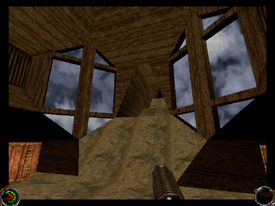
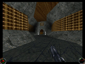
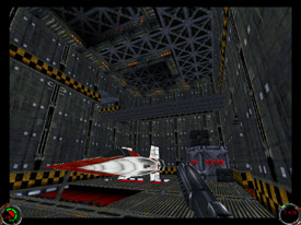
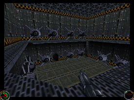
While the architecture in "The Execution" ranged from well detailed to cubic, the best description of the architecture of the level would be solid. For the first half of the level, the design was nicely done. Just take a look at the above screens to see what I mean. Save for one or two places that needed more architectural development and detailing, the player is greeted with nicely-crafted windows scattered throughout the base, curving hallways, and detailed side rooms to explore. Texturing was also well done in this section, in both the areas of placement and selection. The Sulon-type wood textures worked well with the architecture and gave the base a clean feeling. With the exception of a few minor and hardly noticable stitching errors, the only other technical problem in the first half of the level would be the very first room. As you can see in the first screenshot, the hallway goes up and away from the room you start in; however, the superstructure that should be there to enclose the hallway is not visible outside the window. This isn't a huge problem, though it is a little strange to see the phantom hallway head off into nothingness. Otherwise, the first part of the level was fairly well done. My impressions of the second half of the level were not nearly as good. In this phase, the player begins to explore a more modern area of the base. Unfortunately, it seemed to me that shortly after entering this section, the architecture and texturing took at turn away from the precedent sent by the first half. Rooms seemed to become more simple in construction, and some of the textures used seemed to clash with the adjacent textures as well as the architecture. This became excessive by the very end of the level, where the final hangar is hardly more than a few large, similarly-textured boxes joined together and filled with ship 3dos. While the design did have a few sore points, it was relatively good when weighing the level as a whole.
Dynamics / Interactivity
Enemy and item placement were effectively done. Enemies were frequently stationed off on side corridors or around corners for maximum surprise, and items were provided exactly when needed. Whenever I found myself getting low on health, there would usually be a cache of powerups, or in one case, a medical droid. The presence of rail detenator stormies in vast quantities gave the player a good source of firepower for those situations in which a lot of troops were standing around together. As far as enhancements go, the story-supporting cutscenes are much of what you get in this level. Puzzles are rather simple, being limited to key hunts and the like. There wasn't much cog-driven interaction between the player and the environment either; most of what you get are the typical button doors and elevators. For the level's dynamics overall, the placement of enemies and powerups was good, though there weren't any earth-shattering enhancements to speak of.
Playing Experience / Atmosphere
My first impression after finishing the level was "that's it?". I was surprised that the level was so short, probably only taking around half an hour to complete at most. However, it should be noted that this is not a stand-alone mission - it is a component of the Burning Pride series. Therefore, I think that this level and it's ending are an important setup for the later levels of the series. Getting back to the offerings of the level, the atmosphere was about average. Lighting for much of the level was done well, using shadows to enhance the mood. However, like the architecture and texturing, the quality of the lighting seemed to drop off toward the end. Gameplay was smooth with high framerates, and problem-free save for two annoyances. The first problem I had was with one of the in-level cutscenes. Apparently just before the cutscene started, I had walked past a hallway with a rail detenator trooper and caught his attention. During the scene, I noticed red flashes on the screen - yes, you guessed it - I was being cut down with a swinging railgun and had no way to save myself. I encourage authors to ensure that proper precautions are taken to prevent bugs like these. The second issue was a point where two enemies sneak up behind you in another cutscene. After you regain control, the stormies start shooting while your back is turned. Unfortunately for me, I had 10 health at the time. Needless to say, I think any cutscenes that directly involve the player should be designed in such a way as to allow the player time to react to environmental changes that can't be controlled (such as troopers appearing behind you!).


Final Thoughts
This was an above average-level with fairly good design, placement, and gameplay. However, it lacked new enhancements to set it apart from the rest of the pack. It is only the first level of a series though, so I look forward to bigger and better things in the levels to come.
Design:
Dynamics:
Experience:
80 / 100
77 / 100
75 / 100
Overall:
77