The Return of Thrawn
Mission Type:
Author:
Post Date:
Download:
Level Review
Basics
Reviewer:
Overall Score:
Date Reviewed:
Antilles
60 / 100
December 8, 1998
Design:
Dynamics:
Experience:
50 / 100
70 / 100
20 / 100
First Impressions
This was an average level. It didn't do so well in many areas due to realism issues, but read on for the whole story.


Design / Visuals
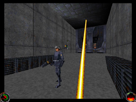
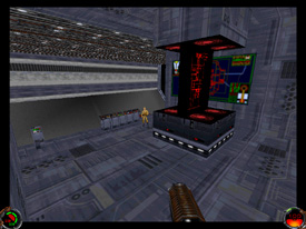
Architecture in Return of Thrawn was not too exciting. There were a few slanted surfaces, and I noticed a few beams in a few areas, but it was just a bit plain. The author made an effort to make the level more interesting, but it needed more. It was a boxy level, and boxy usually means boring, so it could have been improved a lot by some sectors that weren't rectangles or squares. Some octagons and other different shapes would have made for a much more interesting level. The texturing in the level was awful. I don't know how to say it nicely, but the texture choices were rather ugly, and there were a lot of mistakes like textures not matching up. Also, there were big rooms with just about nothing in them, and the same boring texture covered all four walls, and a slightly different one on the floor. The reason I'm being rather harsh is that it looked nothing like a Star Destroyer! The textures didn't look anything like the ones in the movies, and it made the level unrealistic, as well as unpleasant to the eye. I think the level could really be improved if the textures were overhauled.
Dynamics / Interactivity
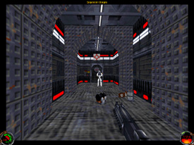
Enemy placement was a little extreme in some places. The author also made some "advanced" troopers which were just stormtroopers that were a lot stronger and deadlier. I consider them crazy troopers, because they're crazy strong, crazy hard to kill, and crazy deadly. Some areas had a few together, and it just made it a little overwhelming. Also, the Thrawn at the end was pretty deadly, but it you used correct tactics, he was beatable. The item placement was also a disappointment. There were not enough power ups to help you combat the many adversaries, so it made the level a little less enjoyable. Virtually the only power ups in the level were stocked in one spot, and more were definitely needed. Either more power ups, or a lot less enemies would do to make this level more fun. I did like the COG enhancement though, it had a lot of interesting features. There were a few doors that appeared to open on a hinge, like a normal door which I thought were cool. Also, there were slash grates, elevators, button doors and forcefields. Some other doors cracked in the middle and slid apart instead of opening conventionally, and they were interesting too. Yet more doors opened when you stepped near them, but one thing that annoyed me was the excessive number of locked doors. There were a few panes of breaking glass, and a nifty thermal detonator trap, as well as a cutscene or two. The COGs really excelled compared to the rest of the level.
Playing Experience / Atmosphere
The atmosphere was not enjoyable. The level looked nothing like a Star Destroyer, and it just wasn't much fun. The Thrawn at the end didn't look like Thrawn, and the puzzles didn't make sense. The level was just unrealistic. Who would put the button that shuts off a force field outside on the hull of a ship? And how can you breathe in a few of the places that were in a vacuum state? Why does the Star Destroyer have toxic waste running through it? I can't answer these questions. Anyway, game play was good, there was just a little minor frame rate slow down.


Final Thoughts
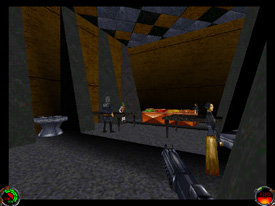
The level seems like it was just thrown together. Perhaps if the author had invested a little more time in it, it would have turned out better. He could still go back and correct some of the huge problems like texturing, and make it into a more decent level. Realism is a big factor in JK and MotS, and it was rather poor in this level. The zoo on the ship really supports this. My advice for the author: slow down, make a quality level, and pay a lot of attention to detail. Choose textures that better suit the project you're working on. Good Luck!
Design:
Dynamics:
Experience:
50 / 100
70 / 100
20 / 100
Overall:
60