Back Home to Sulon
Mission Type:
Author:
Post Date:
Download:
Level Review
Basics
Reviewer:
Overall Score:
Date Reviewed:
Emambu
84 / 100
October 25, 1998
Design:
Dynamics:
Experience:
94 / 100
62 / 100
90 / 100
First Impressions
Well, the plot is nothing new: Siege at Vol Kanst was, basically, the same thing. However, the chance to revisit Sulon, despite being initially unoriginal, did give the author a chance to do some amazing scenes. For the most part he didn't disappoint me...


Design / Visuals
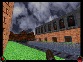
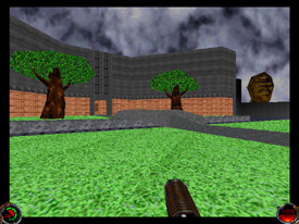
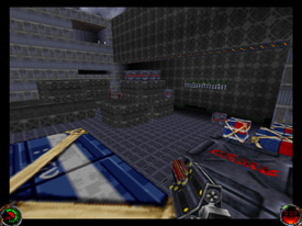
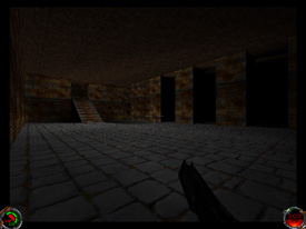
Concerning architecture, I have just one thing to say: Wow! From the moment you set foot on Sulon, you will notice how much detail the author put into his level. Ok, so maybe the landing pad you start out on is a giant box. However, if you look around you'll notice all the natural rock formations that are included. As you walk off the platform, the details just keep on coming. A naturally flowing river cuts the outside perimeter of the base, ledges protrude out of the cliffs, and even the base itself does not appear to be the giant cube like so many other bases have looked like when viewed externally. Inside the base, the architecture tends to get a bit boxy (especially the cargo rooms), but there's a lot of small detail to keep the eye busy. Texturing was equally impressive. What you'll really notice are the new MAT's. The grass is completely different but doesn't detract from the Sulon atmosphere that we're used to. One thing about the textures though; if you view the cobblestone texture at certain angles, you'll notice an interesting warping effect between the stones. I also noticed it in the new grass texture although it is much harder to spot. Despite this, it's pretty hard to notice it and shouldn't decrease the gameplay. Lighting was good in certain areas (caves, basement). However, most of the level consisted of one degree of light. It was a little disheartening to walk into a giant, multi-tiered cargo room that had almost no shadows.
Dynamics / Interactivity
Enemy placement was solid, but I have a couple questions concerning it. Supposedly, the imperials are attacking the rebel armory base. Why then are there civilians milling around with imperials who are doing nothing? Furthermore, why are their Grans and Rodians in the armory? This is an Imperial attack, so there's no reason for the beasties to be here. Then there's the landing pad next to the base. There absolutely no reason for its being there. All it does is balloon the level, since the pad is almost as big as the entire base. Also, it's a complete mess. ATST's randomly roam the area along with rail detonator wielding stormtroopers. Fortunately, the author was a lot more thoughtful with item placement. Shields were placed properly (I always had just enough to keep me going from room to room). Health items were a bit lacking, since most of them were confined to small caches. This means you'll have to hunt around if your health gets low. Ammo was limited to whatever enemies dropped and the rest was placed in the eleven secret areas that are placed throughout the level. COG's is where the level really succeeds. Right off the bat, a new cut-scene throws you into the action as you make your way to Sulon. Several other new COG's can be found, but I won't give them all away. In addition, there are new 3DO's, new KEY's, and new WAV's (my favorite was the sound of the liquid metal).
Playing Experience / Atmosphere
As I already stated, there was a lot of detail in the level. The most noticeable is outside of the base along the rocky cliffs. Although the base itself had some detail, most of it comes off as average, even boring in certain spots. Realism was really well done in most areas. The first couple parts of the base are completely non-linear and help add to the general setup of the armory. However, it is not without some drawbacks. To make the experience longer, the author added several long hallways that really don't serve any purpose and no base would setup their basement like that. Also, the author hasn't gotten the water sounds down completely. In certain spots I would hear the river, clear as anything. Then I would turn around and the sound would disappear. It really threw me out of the realism that the author captured with the stunning architecture. Also, there wasn't much of a mood in the first part of the level. Part of that is due to a lot of the aforementioned complaints, but most is because the author didn't really instill anything in me. The author didn't instill any of the pressure or urgency that I would have expected with an imperial attack. Fortunately, once you hit the caves that all changes. The lack of mood is replaced with an eerie sensation. Then, when you reach the smelter rooms, the red glow and new sounds are enough to make you sweat in your seat. It's a shame that the author couldn't get feel of the level off the ground because it is an important part of the level that some authors seem to forget about. The author suggests a 3D card when playing this level. And for what it's worth, he's correct. The outside areas are enough to make any unsupported machine virtually freeze up with all the lag. Even with a 3D card I still experienced some slowdown. I think most of that is due to the gigantic landing pad that's completely unnecessary. I hope the author avoids stuff like that in future levels. As it is the lag brings down the replay value. Functionality wise, there were no major crashes or bugs that I could find. Other then the texture trouble that I mentioned the level was virtually bug free.


Final Thoughts
This level had a chance at becoming a truly great one. Unfortunately, poor enemy placement and several other little issues really brought down this levels score. I honestly hope that the author continues to edit because with a bit more refinement (ala Beta Testers which were lacking in the text file) the Jedi Knight community can look forward to some great levels from this talented person.
Design:
Dynamics:
Experience:
94 / 100
62 / 100
90 / 100
Overall:
84