Pride of the Empire Level 1
Mission Type:
Author:
Post Date:
Download:
Level Review
Basics
Reviewer:
Overall Score:
Date Reviewed:
Antilles
80 / 100
November 13, 1999
Design:
Dynamics:
Experience:
85 / 100
75 / 100
80 / 100
First Impressions
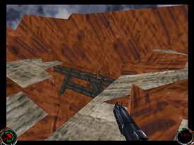
Pride of the Empire I was a decent level. It excelled in some areas, yet in others the quality was less than I had hoped for. The lighting, for example, was uniform and boring, but the outdoor architecute was very nice.
Design / Visuals
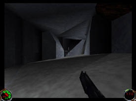
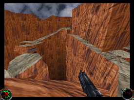
The architecure of this level was impressive. I was especially pleased with the outdoor architecture, for it was quite detailed and realistic. There were a lot of outcroppings, pits, ledges, and uneven ground surfaces. In one of the caves, there was very nice work done on the walls; they sloped in towards the ceiling, and some parts even stuck out more than others, creating a very realistic look. The bridges in the beginning looked great as well, and some other catwalks had nice substructures. On the downside of architecture, I found some grevious errors. I could see the architecture from other areas popping up in the sky because it was higher than the sky level. In another spot, the sky curves up to follow the tunnel, but when you're still outside you can spot the sky actually cutting of the rock, as if it's a solid wall, not open air. The inside areas of the level were rather dull. They were too rectangular, and often times similar to each other in layout. Some rooms had little or no detail, simply existing as little cubes with beds stuck in them. I did notice, however, a bunch of smaller details, such as pillars, catwalks etc., that really helped to diffuse the blocky feeling. Overall, the architecture was quite good. The texturing was also done well, with only a few mishaps. An admirable job was done on stitching up textures on the outdoor architecture; however, there was very little variety in these textures. Only three or perhaps four textures made up the entire outdoor area. Also, in the indoor areas, I thought some of the choices were a little wierd looking, such as the beams that looked like they should be metal but had a rock texture on them. Also, a whole bunch of pillars had the same texture on them, and it got pretty boring to look at their multitude. Texturing on a whole was good; there was decent variety for the most part, and they were stitched well.
Dynamics / Interactivity
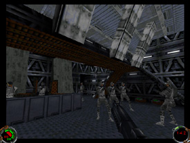
The enemy placement of PotE had a few flaws. First off, there were tons of enemies. Second, many of them were found in large groups together. I walked into a couple of rooms while on my button hunt (more about that later), and found six or eight rebel troops standing around waiting for me. Not only did it put a strain on my health, it was downright annoying. Maybe the author put them all together so the sum of their "rebel" IQ would equal that of one of the Empire's best! There was little or no use of trickery and deceit; merely brute force. For more information on good enemy placement, read my article in the articles section. The item placement was pretty decent. Although there certainly weren't enough powerups, they were spread out well, and didn't seem to be equipped with those repulsorlifts we've seen a lot of lately. Crates and other objects were scattered about to make the areas look more interesting, although I noticed a lot of antique chairs in the rebel outpost that looked a bit out of place. Enhancements were pretty good for this level. I thought it was really cool when I tried to enter a hallway, and suddenly a rock came crashing down to block my path! It wouldn't have been so frightening if there hadn't been seven blaster-toting-rebel hooligans hot on my heels... There was also a cool little stream, and a horde of new enemies to battle against. The zip included a couple of SMK cutscenses as well, and the level itself contained the usual doors, forcefields etc., and even some new vocal lines. Everything conspired to make some nice enhancements to the level.
Playing Experience / Atmosphere
The atmosphere was decent, yet could be improved heavily in some areas. Lighting, for example, I found to be really boring. There was very little use of shadowing, or even light change for that matter, in the canyons, and the whole level basically had the same level of light. It was really boring to look at, and it also made the level loose some of its realistic look. The architecture looked great for canyons, yet the poor lighting totally destroyed this good base. I was a bit disappointed with one part of the gameplay as well; the button hunt. You simply found a way past one forcefield, and lowered the second. Then, after you went behind the one you just lowered, you lower another...you get the idea. It was a very trite puzzle to put in a level with as much promise as this one. I had a few small framerate problems, but they were minor. Thankfully, there were no crashes.
Final Thoughts
You should all download this level and check it out. Although there were a few flaws, it was still a pretty good level. I especially liked some of the canyon architecture. Enjoy!
Design:
Dynamics:
Experience:
85 / 100
75 / 100
80 / 100
Overall:
80