Rescue the Princess - Prequel
Mission Type:
Author:
Post Date:
Download:
Level Review
Basics
Reviewer:
Overall Score:
Date Reviewed:
Antilles
34 / 100
January 9, 2001
Design:
Dynamics:
Experience:
20 / 100
37 / 100
45 / 100
First Impressions
To be frank, I was totally disappointed with this level. You'll find out why in a moment...
Design / Visuals
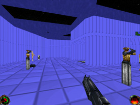
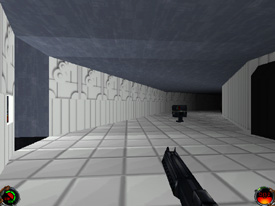
Simply said, the architecture was quite lackluster. There were some nice slopes and rock formations in the beginning, but things went downhill from there. Many places were a bit boxy, or had extremely strange layouts. In one area, there is a gaping triangular hole in the middle of the hallway, and a bottomless pit surrounded by zapping floors that kill you if you touch them. I found very few special details like beams and pillars, and the level just seemed to be of slapdash construction. The texturing too, was severely lacking. The texture selections didn't always work well together, and there were countless stitching errors and cut off patterns throughout the level. Some rooms were plastered on every surface with the same texture, but that sure didn't make matters better. The repetition, combined with total disregard for aesthetics, really caused some problems. The overall design of the level left much to be desired, and I suggest that the author spend a bit more effort on this area in future works.
Dynamics / Interactivity
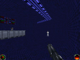
The enemy placement was decent, though strange. In one area, there is a fire-breathing kell dragon, in another, Tuskans, in another, Gran, and so on... There were large numbers of stormtroopers and commandos, but luckily you find numerous armored vests along the way to keep you healthy. Item placement was somewhat lower in quality. Many items were buried into the floor or hovering, but there was a sufficient amount of both power ups and ammunition. Enhancements were lacking, to say the least. There was a new enemy, the fire-breathing dragon, a few doors, an elevator or two, and objectives. I can't recall anything else of interest. Basically, the level could be generalized as a large frag-fest with few other offerings.
Playing Experience / Atmosphere
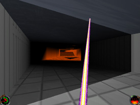
The atmosphere was also of poor quality and seemed to lack real effort. Lighting was carelessly done, especially because the colored lighting is heavily overused in some parts of the level where the scene is completely saturated with orange, or blue, etc. In other areas it was way too dark, so basically you have problems regardless of where you are. The gameplay was not very good; what you have is mostly straightforward blasting with no real purpose or evolving plot behind it. Along with the dull process of walking and shooting without thinking, the level had no interesting twists or memorable events that would serve to make it stand out in any way. On the bright side, it didn't crash and I had no framerate problems due to the simplicity.
Final Thoughts
My advice to the author: take more time and think about layout, and especially about which textures would look good together and which textures mesh well with the architecture. Always stitch them up too, because misalignments look shoddy and unprofessional. Lastly, be sure to use good taste with colored lighting, and use it to highlight normal light, not to light the level by itself. More attention to detail and enhancements wouldn't hurt either. For everyone else: if you're really desperate for a sloppy shoot 'em up, download this level. Otherwise, I'd advise you to stay clear and wait for future levels from this author.
Design:
Dynamics:
Experience:
20 / 100
37 / 100
45 / 100
Overall:
34