Home: Pirates Attack
Mission Type:
Author:
Post Date:
Download:
Level Review
Basics
Reviewer:
Overall Score:
Date Reviewed:
Antilles
68 / 100
January 9, 2000
Design:
Dynamics:
Experience:
75 / 100
45 / 100
80 / 100
First Impressions
This was the first level by this author. For a first attempt at editing, this is pretty decent, but there are still many things that need a lot of improvement. Anyway, on to the review.
Design / Visuals
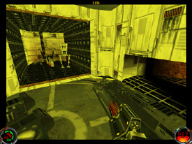
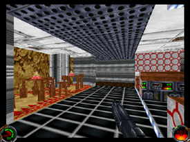
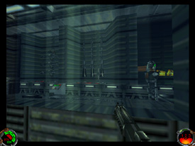
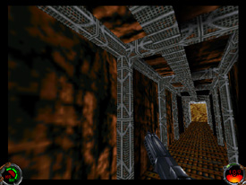
The architecture of Home was pretty decent. As I ventured through the vast subterranean residence, I saw a lot of pillars, ledges, uneven ground, steps, windows, and control panel stations. There were lots of niches and corners for enemies to hide in, and the level came off pretty well as a person's home on Tatooine. There was a pretty nice power generator carved out of architecture that showed some decent skill, but it was a little rough on the frame rate. Despite some pretty nice details, the level still felt a bit boxy in many areas. Also, in one of the areas where I could see up to the sky, I saw the freighter flickering as I moved around. The area on the surface of the planet was not as well done as the inside, however. After climbing up a hill that was well nigh vertical, I dashed over to a vast expanse of nothing. There was just a huge flat area with some R2 units driving around aimlessly. Some ridges, hills, or something would have really made it look a lot better by breaking up the perfectly flat landscape. Overall, a pretty decent job was done on the indoor architecture, but the outside was a little lacking. Texturing, I regret to report, was disastrous. There were a lot of really ugly textures used, and too often they were used in combination with other textures that they openly clashed with. Take a look at one of the screens to see what I mean. (I'm sure you'll know which one, unless you're colorblind.) There were a good deal of alignment errors also, but texture choice was the main problem. Some work needs to be done on choosing textures that look right for the setting, as well as picking ones that look nice with one another. With the exception of one rock texture, there wasn't a problem with drastic overuse of textures. Overall, an average job was done on level design.
Dynamics / Interactivity
I didn't feel that the enemy placement of Home was very good at all. I encountered hordes of enemies. Fortunately, there was a mix of Gran, Trandoshans, Tuskens, and Gammorreans so that you weren't stuck facing the same one foe throughout the level. There were also a couple of Mailocs flying around outside, and I did notice a new type of droid. The enemies were placed well, hiding in niches or around corners, but there were just too many of them. The problem was compounded by the lack of power ups; I found almost none. There was a med-droid that you could keep returning to, but that was a hassle. As a result, the level was rather annoying to play. In the cargo areas, there were some crates and cargo lifters, as well as troop transports that the pirates flew in on. I spotted a few floating chairs and bottles, but as you may find, that is the least of the problems of item placement. There weren't very many enhancements to this level. There were some new droids that you fight at the end, but they sounded distinctly like Kell Dragons when I shot them. Also, there existed some key doors, button doors, and normal doors, as well as a force field or two. Overall, there just weren't very many exciting features to this level. Furthermore, all of the locked doors displayed a message like "COG_01001" when pressed. As I found after my first level, this problem is pretty easy to fix and shouldn't be left in a level for release.
Playing Experience / Atmosphere
The atmosphere was pretty decent. The level felt a lot like an underground home on Tatooine, and the lighting was pretty fair. There were a lot of nice shadows and changes in illumination to make the level feel more realistic. Personally, I did not enjoy the level that much because gameplay was a little lacking. It was basically a key hunt rife with enemies, which isn't a good thing for a level to be. Also, the plot was really weak. Furthermore, the Dark Jedi you meet at the end isn't anyone new; it's just Yun...again. Another problem is that I killed the person I was trying to rescue accidentally with a wide swing of the lightsaber, but I didn't fail the mission or anything. Lastly, I had a bad frame rate in some areas, but it may just be my cheap computer. Judge for yourself on that one.
Final Thoughts
This was a good start for the author. There was decent architecture, though it wasn't exemplary. The texturing...let's just say it needs some work. The same goes for plot and enemy/item placement...and enhancements. I don't mean to sound harsh, but the standards are high these days, and will only continue to rise. I recommend that new authors read all of the level design articles here at the Command Chamber. I'm sure that they'll help a lot and make levels like this even better.
Design:
Dynamics:
Experience:
75 / 100
45 / 100
80 / 100
Overall:
68