Dark Siege III: Strike Force
Mission Type:
Author:
Post Date:
Download:
Level Review
Basics
Reviewer:
Overall Score:
Date Reviewed:
Emambu
82 / 100
January 6, 2002
Design:
Dynamics:
Experience:
83 / 100
85 / 100
78 / 100
First Impressions
The author wisely took a different stance in handling this level. As of now, the Dark Siege series exists in name only. No references are made from the previous two levels; heck, you don't even play the same character. It's a nice change because now I won't have to make a big stink about continuity with this story like I did the previous one (though the idea of a rescue mission has been done to death). As for the actual level itself, I was pleased to find a general increase in quality across the board. Read on to find out more.
Design / Visuals
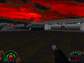
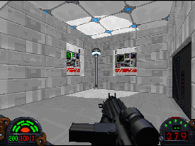
Like I said, there was a general increase in quality in this level from the previous one, and that includes architectural design as well. Many of the rooms within the spaceport were nicely compacted without feeling cramped, and each one contained enough little details to give a sense of unique purpose. There's some good use of stairs and elevators to help give a sense of vertical, three dimensional movement. Beams, pillars, computer consoles, statues, and other additions kept the design from becoming stale. The bar along the upper parts, the prison room at the end, and the central room where the door requiring the officer's key is located are but small examples. The landing pads also added to variety. It's too bad we couldn't see a little more of them since they became the only areas that were physically outside, but I'm not complaining. Only a handful of rooms could have benefited from more detail, like the antechamber beyond the landing platforms which was nothing more than a circular room with a central pillar, but in general I was pleased to see the author taking necessary steps to make his level visually appealing. And of course, going hand in hand with the architecture are the textures themselves. Again, there's a big jump in quality with meshing, repetitiveness, and color choice. Not to say that the texturing was perfect, but the author did do a good job of capturing the look of spaceport. Plus, the textures were varied and flowed well together. Only a few times towards the end (where the author uses a paisley yellow and brown horizontally striped pattern) did I have to stop and think "this doesn't look right in a spaceport," an improvement over the previous level where I was constantly doing that. Stitching was also a lot better. There were still parts where two ceiling textures didn't fit properly, but these instances were few and far between. Overall, they shouldn't detract much from the gameplay.
Dynamics / Interactivity
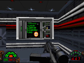
The author has already demonstrated in his prior levels that he knows a fair bit concerning a level's dynamics. Therefore I was pleased, but not altogether surprised, to see that knowledge carried on in here. Enemies were evenly placed and spread out so each fight provided some effort without becoming impossible. True, they're your standard imperial cannon fodder types but attempts were made to level the playing field a bit. Some of the best parts were when the author placed them around corners or out of view so the impatient player would be caught off guard as they haphazardly barreled their way in. For example, not looking up before stepping on to a few elevators could prove treacherous. This is just one example of how the author gave the level more of a challenge with mundane enemies. Ammo was of good quality, and spread around well. There were a few too many shield packs for my liking though. Perhaps thinning them down next time will help heighten the experience. One mistake that I'm glad author didn't repeat, however, was the placement of aliens in an imperial controlled spaceport. To my recollection there was only one, and he was parked out by his ship so it was justifiable. It's a cardinal rule, one that I and many other level reviewers stress. Also adding to the dynamics greatly were the enhancements. Out of the three levels, this one probably has the most in the way of new stuff, even if much was borrowed, with permission, from other authors. Only a handful of BM's, and the LFD and loading screen, are original. The remaining BM's, FME, WAX, 3DO's, and VOC are borrowed from other addon levels but they work in well the atmosphere here. The skyline and the readings on some of the computer terminals were nice touches in particular.
Playing Experience / Atmosphere
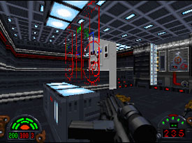
One of the biggest improvements about this level, which the previous ones were lacking in, was consistent, dynamic lighting. We saw a little of it in the first level, it disappeared entirely in the second, but now we get to see some good contrasts in this one. The shading outside in the landing pads was a noticeable difference from the sterile light within the spaceport. There are also lamps throughout the interior parts that actually make parts of the room seem brighter and more pristine. I thought it was a good move by the author since much of his level takes place inside. He could have easily let over ninety percent turn into one monotone glare but chose not to. This extra effort is noticeable in overall atmosphere of the level. The plot is also significantly improved from the previous level. There's more detail, and a lot more back history to give the player a sense that there's something bigger going on around what he is focused on. However, it's still not great. Rescue missions have been done far too many times in the past, and since it's the only objective in the level, even extra detail doesn't help shake the feeling that we've been there and done that. However, that's a minor issue. There was only one major problem with this level, but it's a reoccurring problem: semblance. The level is much too linear to look like a proper spaceport. There was always only one way to move, and you're practically forced to visit every room. This hurts the realism and the atmosphere as well. It also makes for mind-numbing play. Remember to keep the layout of your level diverse, allow for multiple paths and ways to get to a similar place as well as extra areas off the beaten path. Not only with this make the level seem more realistic but it will also add to the replay value as players will want to come back and try alternate routes. I've never seen a building where there was always only one way to progress. Mechanically the level was clean. No crashes or hang-ups. There weren't any small glitches like HOMing, and there wasn't any lag or slow down. I'm pretty sure that any computer that can run DF can run this level too. Only a few stitching errors keep this from being spotless.
Final Thoughts
Definitely the author's best one of the three. If you're a fan of his previous levels, then I strongly recommend this one. Actually, I'll recommend this one to anyone because it's certainly worth looking at once. It's a big jump in quality and there are a few things worth seeing.
Design:
Dynamics:
Experience:
83 / 100
85 / 100
78 / 100
Overall:
82