Yenn Korron Series: Chapter 1
Mission Type:
Author:
Post Date:
Download:
Level Review
Basics
Reviewer:
Overall Score:
Date Reviewed:
Antilles
82 / 100
September 29, 2001
Design:
Dynamics:
Experience:
73 / 100
73 / 100
88 / 100
First Impressions
Yenn Korron Series: Chapter 1 had the potential to be a great level. However, there were a few problems that brought it down to make it a "good" or "average" level. The largest problem was texturing...read on.
Design / Visuals
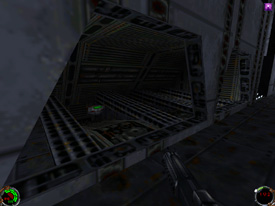
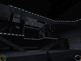
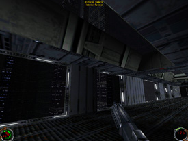
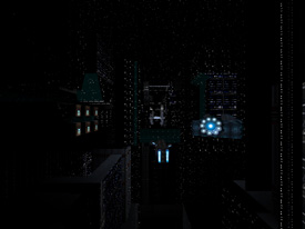
YKS:1 had some excellent architecture, but it was not fully consistent. Some areas were just bursting with details like pillars, sloped surfaces, stairs, ledges, catwalks, beams, you name it, while other areas were big empty rectangles. The worst occurrence of this problem was the warehouse area; behind the warehouses, there were large, boring alleys with nothing in them that led to even larger empty areas. Fortunately, these boring areas were not as common as the nice looking areas of the level, which had a lot of great details and were very pleasing. I was happy with the use of sloped surfaces because they were used effectively to create some interesting areas, and made the level look smoother and nicer. Also, there are a number of places where you can look out a window at the city; they're a very cool idea, but the textures on the buildings don't look very good, especially from close up. There was one last thing dealing with architecture that disturbed me; it seemed that many of the areas in YKS:1 were remakes of areas in Jedi Knight! I was forced to play through the same places as seen in JK (which was pretty boring, I like new stuff) and they weren't even made as well as they were in the original game! They were cheap imitations, and it was disappointing to see such lack of originality. It would have been different if these areas had been made better or were improved somehow...but they weren't. Texturing...buckle your seatbelts everyone. Texturing was terrible, no doubt the worst part of the level. Such a slapdash texturing job is inexplicable; with the 3D preview, it is very simple to stitch surfaces, move them around, and just make everything clean looking. As it is, there are tons of misalignments, cut off textures, and selections that clash horribly with one another...it looks sloppy. There is a texturing problem in virtually every sector! I walked down one hallway and counted at least a dozen errors. The lights on the floor next to the wall were not centered, causing them to be cut off, they didn't match up between sectors, and they came nowhere remotely close to fitting correctly as they turned corners. In another spot, I found a bit of a mix up. The texture that predominated on the ceiling was found on one or two surfaces in a fan-hole in the ceiling, while the textures from inside the fan-hole were found on a surface or two on the ceiling around the hole. Oops! These are just a couple of examples of how the level is textured as a whole. It was careless and sloppy. More time and care could have turned it into a professional looking level.
Dynamics / Interactivity
Enemy placement was a positive aspect of YKS:1. Enemies were often up on catwalks, hiding in dark corners, waiting around the bend, etc. Furthermore, they were not placed in overwhelmingly large groups; usually there was a reasonable amount, such as two or three bad guys. It turned out to be a nice challenge without becoming very aggravating, so enemy placement was a success. Item placement was decent, but not spectacular. Power ups were not distributed evenly in the level; there were very few in the beginning and I was getting quite low before I found another supply, but then I ended up leaving 5 or 6 shield packs behind at one point! Then the cycle continued and I started getting really beat up again, and since there were no power ups in the area where I was, I had to run all the way back and pick up the ones I hadn't been able to use before. It was not a significant problem, just slightly weird and annoying. If you "average" it all out, there is a good amount of health, shielding, and ammunition in the level. The enhancements of YKS:1 were pretty decent. There were a number of cutscenes, and although they were kind of slow and boring, they got the point across. The voices needed to be louder though, I could barely hear them. You had your usual run-of-the-mill stuff like key doors and elevators, and there were new weapons and spaceship 3dos to spice things up. Unfortunately, there were lots of cog errors that caused messages like "cog_01001" to be displayed. Lastly, the objectives were poor, all you have to do is find someone and kill him. Now, before you yell "hypocrite," this project was in the making for over a year, so I'd expect something more substantial in the objectives. Overall though, the dynamics of YKS:1 were good.
Playing Experience / Atmosphere
The atmosphere was excellent, it felt very much like Nar Shadaa. The lighting overall was decent, but there were a number of problems. For example, on a wall there would be one section of a surface that was completely dark, and right next to it would be the other half that was lit brightly. This terrible streaking was very common throughout the level. Gameplay was a strong point of YKS:1; I enjoyed the level and it was nice and long, yet not boring. Furthermore, it was not too hard, nor was it too easy. However, a few things were unrealistic, such as a Rodian telling his fellows to kill me after I had already blown him away. Those little problems didn't ruin the level or anything, they were just small items that took away from the overall quality a little.
Final Thoughts
YKS:1 is a good level, it's very fun and it is long enough to keep you entertained for a while. I suggest you download it and try it out...though it is 17MB, eek! Maybe try starting it when you go to sleep and see if it finishes by the time you wake up.
Design:
Dynamics:
Experience:
73 / 100
73 / 100
88 / 100
Overall:
82