Narra: A Slave's Tale Part 2
Mission Type:
Author:
Post Date:
Download:
Level Review
Basics
Reviewer:
Overall Score:
Date Reviewed:
Emambu
74 / 100
February 7, 2000
Design:
Dynamics:
Experience:
64 / 100
78 / 100
77 / 100
First Impressions
The plot may not seem interesting now, but there's a rather lengthy cutscene in the beginning which goes into much more detail, and there are a few surprises along the way. My personal favorite was at the end. It serves as a nice build-up for part 3. I didn't find any glaring plot oversights other then fact that the world of Mon Calamari was chosen as the setting. Although I'll admit that there aren't many levels based on this watery planet, I do think that, as a rule, most authors should steer clear of familiar settings unless it's absolutely necessary. By choosing familiar planets you are forced to abide by the established rules, lest you be picked apart by reviewers. Choosing worlds that are unknown, or just making up your own, allows for more freedom. Fortunately for the author, there is much ambiguity within the plot because we have not yet determined who Narra is or why pirates are attacking Mon Calamari. I just hope that the author doesn't trip himself up down the road.
Design / Visuals
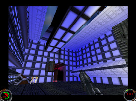
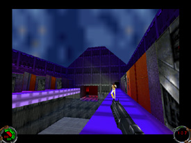
Despite the fact that, architecturally, this level barely fits average standards I was still somewhat pleased with it. If anyone played the first "Narra" then you can recall what the design was like: boxes, boxes, some hallways connecting the boxes, and maybe one or two attempts at real detail. Here there is improvement. In fact, the first couple rooms were well done. The author placed beams, pillars, slants, varied the elevation, and added several nice touches detail. With that out of the way, there are also several things that the author needs improvement on. For example, the central part of the city is nothing more than giant rectangles jutting out from the ground. The only object that let me know they were buildings was one door placed at the base. There needs to be more then one door to successfully pass off something as a building: windows, balconies, or even multiple doors would have helped. Texturing was also a step in the right direction. In the authors first level, textures were used over and over again. Here there is a bit more variation. Also the texture choices help bring out the feeling that much of the city is underwater. Of course, it wasn't perfect either. Certain spots, primarily hallways and in the central part of the city, were largely dominated by one texture. Also, there were a couple areas where textures were stitched and aligned incorrectly, but it didn't detract from the game much.
Dynamics / Interactivity
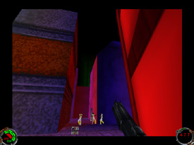
Enemy placement, throughout much of the level, was either well balanced or even a little on the light side. It seems that the author has gone the other way from his previous level, which simply had too many enemies. In this level there was only one area where it got excessive, and that was during the main fight in the central part of the city. There must have about 40-50 enemies and an equal number of allies crammed into a small area. For one thing the fight didn't look believable with that many characters fighting, and secondly the framerate was brought down significantly, even with a 3D card. However, that's the only part. All the other areas were well balanced. Item placement was a lot better as well. Ammo was mainly regulated to what you could pull off of vanquished foes, but before a tough fight you could always find a cache of supplies to get you through. Also, placement of shields and health packs were much better. Before the giant fight in the central part of the city you find shield packs to get you through. Within the room, there's a revive in case you take too many blaster hits. Now, the enhancements were an interesting part of the level. The author had obviously made some progress in the number of new features. However, some of them end being detrimental to the level as a whole. For starters, the Mon Calamari look odd when viewed from the front. Secondly, the music is terrible. I have no problem with techno music itself, but use it in a techno based game. SW is not one of those games. That out of the way, let's never again put it into a JK/MotS level. Lastly, the cutscenes, while very good in providing us pieces to the story, need something more then characters standing idly while text scrolls on the top. More movement is needed. If nothing else, just make them turn to face the person they're talking to.
Playing Experience / Atmosphere
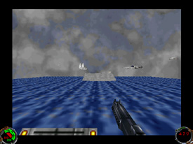
Concerning the lighting, it appears that the author has gone from one end to the other. In the first "Narra" the lighting was uniformly lit and dull. Here, the lighting is colorful and varied. While I have no problem with the variation of lighting, the abundant use of colors does make the level look strange. In one hallway alone, I counted at least three distinct color changes, and that's too much. Also, the colors are intense, and it's impossible to miss them, short of not having a 3D card. Fortunately, variations were believable. There's some nice use of shading at certain times. I hope the author applies throughout the entire level next time, and drops the colors when they aren't necessary. While there aren't any plot problems, I did find a few realism issues. The big problem is the author's attempt to make the level look like it's underwater. At times you can look out at Drugons and Dianogas swimming in a cloudy blue texture which is supposed to be water. However, that part isn't the problem. The problem is that where the level's walls and the water meet, something gets messed up. The walls end up looking two-dimensional. At times I could look out of some windows and the walls forming the edge of the window would have no depth to them. In one room there doesn't appear to be anything holding the water back. There's no forcefield or unbreakable glass. It makes the whole room look fake. That's my biggest concern. In the exterior shots of the nodes you can literally see the boundaries. Also, why would there be rock textures in an underwater city, and why would there be daylight? Fortunately these are minor complaints. One nice thing is that there were no semblance issues. The level flowed nicely between residential and military structures. Also, the level has a pretty high framerate except for in the central part of the city where you have to fight up to 50 enemies. Furthermore, other then some texturing problems, there were no glaring bugs. The level won't crash on you, and HOMing is relatively nil.
Final Thoughts
Overall, despite its problems, I think this is a step in the right direction. It shows to me that the author is willing to improve. At this rate, with the experience he's gained from this, I wouldn't at all be surprised if his next level was truly memorable. As for this one, you might still want to try it out if you're curious or if you've already played the first "Narra."
Design:
Dynamics:
Experience:
64 / 100
78 / 100
77 / 100
Overall:
74