Beyond Glory 1
Mission Type:
Author:
Post Date:
Download:
Level Review
Basics
Reviewer:
Overall Score:
Date Reviewed:
Emambu
80 / 100
Unknown
Design:
Dynamics:
Experience:
70 / 100
80 / 100
87 / 100
First Impressions
After reading the text file I was all set for a boring level that would put me right to sleep. The idea of Kyle destroying a super-weapon has been done so many times before. Fortunately, the briefing that the level comes with is a little more sound, and detailed. It put me in a much better mood after the lackluster text file.


Design / Visuals
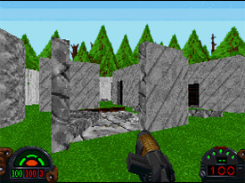
Architecture, unfortunately, was a disappointing part of the level. Everything except for the outside areas was done using cubes or rectangles. While I can understand this in an imperial base, there was no reason for boxy rooms in the temple scenes. The author had an opportunity to do some amazing architectural work, and blew it. Fortunately, the outside areas were well done. Natural rock formations, ledges, and arches populated the exterior portions of the level. I just wish the author had spent more time working on the inside scenes as he did with the outside ones. Texturing was equally disappointing. At one point the imperial base stops looking like a base and starts looking more like a museum. Pieces of hieroglyphics are scattered along the wall along with swords and other antiquities. It looks nice, but this is supposed to be an imperial base! The drawings along the walls was a nice touch inside the temple. However, there's no way to decipher them, since the temple isn't included in the briefing and the author doesn't offer any hints while progressing through the game. As it is, the drawings are just...there, with no real meaning to them. Lighting was the saving grace of the level. The temple was dark and had an eerie feel to it, which heightened the tension. In contrast, the imperial base had the bright sterile lighting that we've all come to know and love.
Dynamics / Interactivity
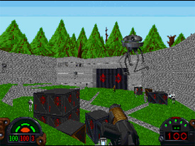
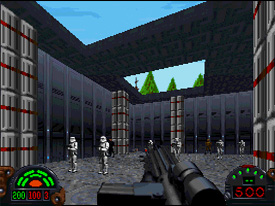
Enemy Placement was really poor in certain areas. In one room I counted about 30 enemies just milling around. The thing that bothers me is that this room isn't a very important one, as the only item of any value is an elevator. Also, in another room I counted about 15 DT's. DT's are bad enough when there are a couple at a time let alone 15. Things like this increase the challenge but at same time frustrate the player. Fortunately, the rest of the level had good enemy placement and the items were also placed with some thought. Although I thought there was a little too much ammo in the beginning of the level, the author was smart enough to limit it to small caches and whatever the enemies dropped. INF enhancement is where the level really takes off. In the first few seconds of the level, you'll see signs showing that the author wanted to add something fresh to the aging DF game. A new enemy from JK makes an appearance for the first time on the DF engine. Complete with the sounds that we've all grown used to, these little buggers populate the opening scenes of the level, adding to the gaming experience. Several new BM's and FME's can be found here as well (although the mountains were a bit too cartoonish) along with new VOC's (some are hard to understand though) and a WAX that I don't think I've seen before (It's a WAX of an ATST commander). All of these things really help make up for parts of the level that were lacking.
Playing Experience / Atmosphere
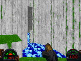
There was a lot of detail in the level that I missed the first time through. Although most of it consisted of the new BM's, some were in the one or two places where the author opened up the level and created some huge rooms that had a lot of little things going on (the lighting that spirals down a long power cylinder is one example). Realism, however, suffered. "TIE Defender Base" had a layout that was believable. This level randomly placed rooms without much semblance. Despite the fact everything fit where it should, (control rooms were with other control rooms, and power areas were with power areas) I exited level feeling that the base as a whole was too messy and erratic. Why is the switch to a forcefield only accessible by crawling underneath an elevator? Wouldn't it make more sense to have it by some computer stations. It's possible to hide a switch and still pull it off realistically. Fortunately, the mood increased the gameplay value. The opening scenes were almost scary, with brand new enemies flying around in the pitch black tunnels, screaming through the inky darkness. Also, the ending started out tense, but then the author immediately killed the mood by flooding the room with 15 DT's. Still, for the most part, the level was a lot of fun. With all the new features, this level is one that you could play two or three times and still not see everything although some of that is due to the size of the level- it's really huge! Therefore, this level has a high replay value, and the opening sequences in the dark depths of the temple only add to the said replay value. The level ran smoothly on a P133.. Some lower end machines may experience some lag trouble in some of the bigger areas. However, the author doesn't have a lot them so it should run expeditiously all the way to the end. The author mentioned some HOMing by the abandoned buildings, but I didn't notice it.


Final Thoughts
For all my bashing, I liked this level. It's long, eerie in certain areas, and contains a bunch of new features. If only the author could have organized the base better and included some architecture that doesn't consists of boxes, then we would have had a winner.
Design:
Dynamics:
Experience:
70 / 100
80 / 100
87 / 100
Overall:
80