Alert Red
Mission Type:
Author:
Post Date:
Download:
Level Review
Basics
Reviewer:
Overall Score:
Date Reviewed:
Ezekiel
15 / 100
Unknown
Design:
Dynamics:
Experience:
10 / 100
5 / 100
5 / 100
First Impressions
One look at that plot description and I knew I was in trouble. The amount of typos in the description alone (fixed for your reading convenience) show that the author put little or no thought into the plot whatsoever. Another hint towards the author's hurriedness is that this is just a modified version of the "Steal the Death Star Plans", which the world could use a lot less of. Sad to say, the level is about as inspiring and inventive as the description.


Design / Visuals
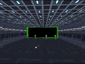
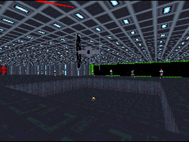
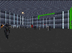
Level design throughout was extremely poor. It is obvious that the author spent little or no time at all on planning and layout. Architecture is limited to boring cubes with a few windows that look out into a flat wall of stars. Obviously the author did not make sure that the stars looked like space instead of like a wall. Worse yet, the cubes were way to big, and so almost every room was filled with the dreaded "Hall-of-Mirrors" which plagues so many Dark Forces levels. Texturing was poorly done as well. The texture choices were not varied, and stitching was bad in most locations. Occasionally, the author aligned the textures correctly, but most of the time, the alignment was wrong.
Dynamics / Interactivity
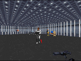
Enemy placement consisted mostly of enemies in straight lines just behind a door, and so got extremely predictable. However, to overcome this predictability and make the level more challenging, the author decided that it would be best for you to figure out how to beat the entire Imperial navy with a blaster rifle. Item placement was extremely scarce, and beating this level is pretty close to impossible. The author was kind enough not to include difficulty settings, as well, so that it would no longer be tempting to take the easy way out. Level "enhancements" consist mostly of a few new enemies, some of which are poorly done, while others look fairly well done.
Playing Experience / Atmosphere
However, the most lacking feel of the game is a sense of atmosphere. There is nothing convincing you that you are experiencing the level. There is no interactivity and no realistic architecture. You can look out a window where you should see a part of the space contraption you are in, which the author never says what it is, but you do not, pulling you even farther away from an enjoyable experience. Gameplay is poor as well. Bugs are abound in this level, ranging from typos to HOMing to clipping. The only bug that this level does not have is a crash bug. The level can be played, although laboriously, until the finish.


Final Thoughts
There really is no worth in downloading this level. If you want a few minutes of cheap, guns-blazing action and a challenge, this level might suit you, but it can probably be found in a better variety somewhere else. Most other shoot-em-up levels have decent architecture, texturing, and gameplay, but this one fails on all counts. Download this level only if you really want to, otherwise steer clear of it.
Design:
Dynamics:
Experience:
10 / 100
5 / 100
5 / 100
Overall:
15