Level Design Fundamentals
Lately, I've noticed that there has been a shortage of excellent custom levels. Aside from a few exceptions, I feel that many
recent levels have been rushed, or haven't had enough effort put into them. To remedy the problems of editing today, only two things are needed.
Time and effort. If you take your time and work hard, you will be rewarded with a good level. In this article, I will help explain what goes into a
good level, and offer some advice on how to do a few things.
Architecture
The first step to making a good level is architecture. It's the base of everything that goes on in your entire project, so you
need to make it nice. Try using differently shaped sectors instead of all cubes and rectangles, because it will make things have much more variety,
and therefore make your level more interesting. You need to watch out for the dreaded blockiness which just makes a level boring to look at. There
are also many more things to put in a level. Make use of beams, ledges, windows, etc. They make things more realistic and interesting. The key to
making a level is to make it cool. You need to have lots of aspects that make it special and different, as well as adding to the appearance. Make
bridges, archways and pools in your open marketplaces, and lots of beams, shelves, desks and bars in your interior areas. All of these things will
make your level much more appealing to players. Another secret to making a fun level is making little or no restrictions on where the player can go.
Make all sorts of side alleys, hotels, living quarters, weapons rooms, control centers and cantinas that the player doesn't necessarily have to go
to. It makes a level much more enjoyable for the player to be able to explore on their own, not forced to go on a one-way path. Open things up, and
create new and interesting areas. Once you have details and places to go, you have an awesome start to getting an excellent score on your level. One
warning though: From personal experience I know that you should be careful of framerate in detailed areas. Try to restrict views of tons of adjoins,
or even create 3dos of some your simpler architectural ideas. By doing so, you can have an interesting level, but not one that suffers in the
gameplay area.
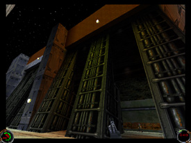
 An example of good architecture and lighting. Notice the angled beams and
shadows.
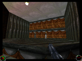
 Boring architecture. Here you see a boxy room and plain, repeating
texturing.
Texturing
Texturing is the next step in the long process of creating a memorable level. Make sure that you choose textures that look well
together, and are realistic for the type of area you are trying to create. Stay away from boring, generic, textures and go for some of the nicer,
more interesting types. Also, make sure you pick a master colormap, for it will give you a more specialized group of textures that work well
together. Most importantly, create architecture with textures in mind. For example, make some beams that you know will look well with a nice wood or
metal texture. Try not to make architecture without textures in mind, because it's possible that you won't find anything that fits or looks good.
Always make sure your textures are stitched correctly because it is so easy to do. A way to have good texturing is to use different textures in
unorthodox ways. Look for certain parts of textures that would look good on tidbits of architecture. It will give your level more texture variety,
and possibly a much nicer look. Try working some textures you don't use real often into your level where they can make it look awesome.
Experimentation is a large part of level editing, so save and try some ideas out. If things get totally screwed up, just revert to saved, and try it
again using a better method.
Enemy Placement
Enemy placement is very important to having a fun, enjoyable level. I have a few basic rules that I follow when I create my own
levels, and they help to keep me straight in this area. First, never mix smugglers and Imperials together at any time, unless your plot specifically
details them working together. Also, never - and I mean never! - place huge masses of stormtroopers in ranks upon ranks of men. This isn't Dark
Forces. Stormtroopers in JK and MotS can be tenacious, cunning and dangerous when placed correctly. Use them sparingly, and to do that, you need
good enemy placement. Always try to give the enemies a slight advantage so that you need less of them to cause damage to the player. Give them
elevation advange, because it's hard to fight enemies when they are up above you and have cover. Try placing them off to the sides of doors so if a
careless player just rushes through, he receives some raw energy to his rear. Hide them in niches and behind bars, anything to give them a jump on
the player, or at least some limited cover so they can get off a few shots. I like to hide Rodians in fans, partly because it's funny, but also
because they can get a shot on an unsuspecting player. Item placement is also very important to a level. Always make sure there is a pretty good
ratio of powerups to enemies. You want to have the player in decent condition at nearly all times so that he can enjoy himself without being to
worried about dying. But, on the other hand, you want to have the player enjoy the sight of some shields. If there is a tough area where you think
the player will receive heavy damage, put a super power up i.e., a revive or armored vest. Another way to lure the player into some damage is to put
some powerups in a very obvious position so that they rush over to them, and are subsequently shot in the back by some sneaky Rodians or Gran! To
synopsize this section, make sure you give the enemies a slight advantage so that you need less of them, and give a decent amount of powerups to
keep players alive and happy, yet on their toes.
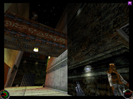
 An example of good enemy placement. Notice the appropriate number of
enemies scattered around in strategic positions, such as on top of the bridge.
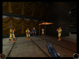
 Horrible enemy placement. If you ever put enemies into a level as seen
above, you need to rethink your design and consider gameplay.
Enhancements
Enhancements are incredibly important to making an enjoyable mission. Always use a bunch of normal cogs, such as doors,
forcefields etc. to get a nice base for the rest of them. Then upgrade to some advanced cogs, like scripted sequences, or special mission
objectives, or ships taking off. Stuff like that. Things like waterfalls, conveyor belts, and ambient music/noise add a whole lot to the realism and
feel of a level. A lot of things are also specific to just your level, so you'll just need to be creative and invent new things to make gameplay fun
and interesting. Also, make some new 3dos, textures and creative architecture to make things just all come together for an awesome level. If you
have a lot of new, interesting features, it will make your level memorable. Some decent levels are still rendered unremarkable after a week or two
because of their commonplace enhancements, as well as their boring overall level design.
Atmosphere
Atmosphere is equally important to creating a high quality episode. You need the player to feel like they are there, being the
character, fighting for their life. Things need to be realistic and interesting. The player needs to feel compelled to finish their mission, or feel
cautious when exploring through creepy areas. Atmosphere creates all of these feelings. Good lighting is vital to creating an excellent atmosphere.
Not only does it make the architecture so much more beautiful, it adds a whole lot to the way a level feels. It's really hard to explain, but you
need your lighting to suit the way your level should be. Use dim lighting to set a thoughtful, yet eerie feel, and brighter lighting for a more
straight-forward fight. Try never to have your mission a uniform level of light, because that just makes things boring to look at. Make good use of
shadowing, and if you edit MotS, colored lighting. Colored lighting is just so awesome because it can totally transform an area, and highlight
different details so well. Use it well, and you will create some of the most lasting pictures in the minds of others who will look in awe upon your
masterful setting.
Gameplay
Gameplay is the last area I will be discussing. To have good gameplay, first you need decent frame rate so that people can play
easily. However, more importantly perhaps, you need interesting stuff to do. Try to make it so the player has to go around obstacles in their way.
Don't always make it key doors either. Use some things that they can never get open, like rubble collapses or huge broken doors. Make it so they
just find a way around, not a key to open it. Have them follow interesting paths through the level, and let them go places where they don't need to
finish the level. Give them freedom to enjoy themselves and explore. Also, try to make an interesting plot so that they are interested in
completeing their goals. Try to put a totally unsuspected twist on the happenings in your level. For example, in my latest level, Battle of Toprawa
II, I made it so that you are captured before you complete your mission. I was hoping it would come as a shock to everyone, and it also gives me a
nice way to continue my series in a totally different setting.
Try to use everything you've read here, and make a truly excellent level. I would love to review more of such levels, let me tell
you. Also, if you need help more specific to your level, I am always willing to assist a fellow editor. E-mail me if you have any questions,
comments, concerns, or compliments.