Colored Lighting
In this article, I will discuss methods for creating nice-looking colored lighting. It will give general guidelines for the most
part, so if you have questions specific to your level, feel free to e-mail me. Lastly, I will give some examples of both good and bad lighting and
discuss how to make sure that your lighting will be easier to do.
Basics
First I will outline some of the basics of colored lighting usage in MotS. Number one, colored lighting should not be used in
place of white light, but to augment it and make areas more interesting. It's important that you don't overuse it, such as filling a whole area with
nothing but color, but you can certainly use it more than sparingly. Next, when you insert lights from preexisting colored lights expecting them to
be the same RGB (color), they won't be! They change slightly for some strange reason, so be sure to change them back to what you want. Finally, when
you're changing intensity for colored lights, always change both the white light intensity and the RGB intensity, and to keep things simple, make
them the same number as well. Now, on to the methods used to create a masterpiece of colored lighting... (Note: I will use the screenshots as
references, and screen shot 1 will be top left, 2 top right, 3 bottom left, 4 bottom right.)
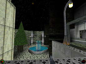
One interesting use for colored lighting is a blue glow on water. As seen in screenshot 1, I made a fountain that has translucent
water and a relatively deep basin inside the walls. First I placed three lights down under the water and chose a color for them. After you do this,
it's a matter of moving the lights around, or adding another so that they light the area as you like. Furthermore, if you just want a dim, hazy
blue, you should leave the range relatively high while lowering both intensities to a low number, such as 3 or 4. If you want intense, i.e. very
blue, light to come from the water, leave the range low enough so that it does not encompass more than a third of the area you are lighting. With
the intensity left on 10 (the default), you will have a very bright blue.
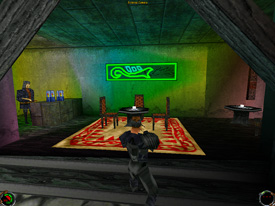
One guideline of colored lighting is to make sure it is tasteful. Take a look at screenshot 2, which I have denoted "the Rainbow
Cafe". Perhaps it is a bit gaudy, but I thought it was kind of cool looking so I kept it in my level. However, I don't recommend using colored
lighting in this nature, especially not more than once, because in the eyes of your potential reviewer it may be poor lighting. You probably
shouldn't attempt too much color mixing before you are confident of your lighting skills because it can be more difficult than just throwing in a
bunch of different colors.
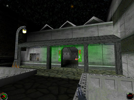
One further aspect for colored lighting usage is a having viable source. While I don't feel that you always have to have a source,
it's nice to add some realism to your level. As it may be obvious, I like to create green light that comes from neon signs. Say for instance that
you are making an area just like screenshot 3, with a nice glow coming from the neon signs around a door. First, make two lights and color them
green. Next, place them to the top and a little to the sides of the doorway. You should make sure that you don't place a light so that the color can
go the opposite direction that the source is supposedly projecting it, as that will be unrealistic and strange-looking. If you wish to create a
rather dim, spread out glow such as in screenshot 3, make the range of the lights about .4 or .5 and the intensities below 5, depending on how
bright you want the color.
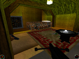
Now, it's time to address some of the problems that can arise through detailing your level with beams, pillars, and other things
that require cleaving sectors up. In screenshot 4, I made the mistake of cleaving the vertical aspect of the beam sector first instead of the side
view. By doing that, I caused little strips to screw up the lighting on the floor. If you plan to make something similar to screenshot 4, it may be
beneficial to cleave the beams from the side view that looks down the length of the room. If you have strange cuts all over your surfaces, it is
likely to bring light along the edge, which will create lots of crazy streaking patterns. In addition to this article, make sure you learn all of
the proper techniques for regular lighting so that you may carry that knowledge over to the colored variety.
Summary
I will leave you with a summary of the guidelines for quick reference. In addition, don't hesitate to e-mail me or leave me a
message on the forums if you need a little advice.
- Use colored lighting to augment white light.
- When inserting, make sure to fix RGB - always change both intensities.
- Make sure your colored lighting is tasteful.
- You can always add more lights if you need them.
- For dim color over a large area, high range, low intensity.
- For bright color over a small area, low range, high intensity.
- As much as possible, use a source to add to realism.
- Avoid strange cuts and cleaves on your surfaces.
- Think about lighting before you cleave a sector to death, what would be the most efficient way to cut this up?